


What It Took to Make Composer Agentic for Home Depot’s Brands
Timeline: Sept 2023 - August 2024
When Home Depot’s media team, OAM, started using Composer, they hit a wall: onboarding users across brands like Behr and Husky meant pinging Kargo support every time someone joined, switched teams, or needed access removed.
Composer had a user management page, but it wasn’t scalable. I redesigned the experience to give clients full control, while keeping it intuitive for non-technical admins.
Read time: 3 mins
Button: See the Product Vision
The Problem:
Before:
Only Kargo could add or remove users
No concept of “Brand” inside a Company level
Disjointed modals, unclear labels, flat hierarchy
This led to:
Frequent support tickets
Cross-brand visibility risks
A frustrating experience for teams like OAM managing multiple agencies
What Changed
-

1 Restructured UI
-

2 | User Roles
-

3 Merged Key Actions
-

4 Scope Access
-
5 Filter Feature
1.
Before:
Admins could only search across a flat list of users with no ability to isolate brand-specific teams.
After:
I introduced a Brand filter dropdown, allowing Admins to instantly view users tied to a specific brand. This is critical for managing large accounts like OAM, where brand-specific oversight is essential.
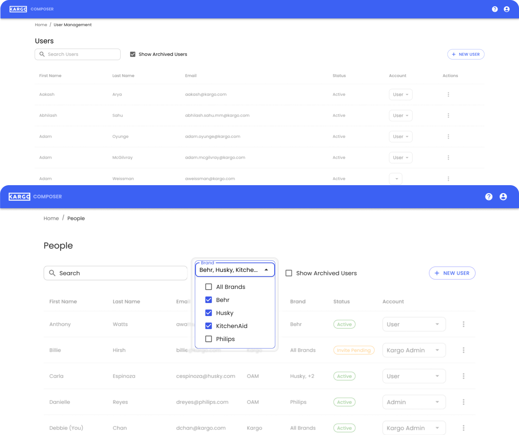
Brand Filer For Focused
Management
2.
Before:
Role assignment dropdown was unaligned with the account column, with distinct user role hierarchy.
After:
I redesigned the User Role UI to:
Surface roles inline using the dropdowns that match visual hierarchy
Clearly defined role levels from Kargo Admin (full access) to Restricted User (limited access)
Make role changes fast, visible, and intuitive
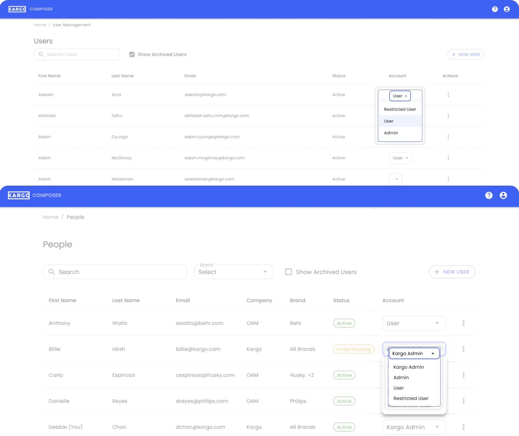
Admins can assign the right permissions with confidence.
Redesigned User Roles with Clear Hierarchy
Before:
Statuses like “Active” or “Archived” were displayed as plain text, super easy to miss and hard to scan.
After:
I introduced "visual “chips” to reflect user status, using color and typography to make activity statuses (e.g., Active, Invite Pending) pop out instantly.

3.
Status Chips for Immediate Visual Feedback
Before:
The search bar only filtered by first or last name, and provided no feedback on what matched.
After:
I expanded the search functionality to include the email column and added inline highlighting styling so users can easily spot where matches occur. This makes it easier to locate people in large, cross-brand orgs.

4.
Improved Search with Highlighting Across Fields
Before:
Admins had to jump between two separate flows, one for adding users, another for creating brands. This was slow and error-prone.
After:
I combined both actions into a single, streamlined modal that supports:
Adding new users
Creating and assigning brands
Role selection—all in one place
This reduces friction and makes onboarding smoother for teams managing dozens of brands.
5.
Improved Search with Highlighting Across Fields